Data Storage Decoded: Data Warehouse vs Data Lake Explained
Top 10 web design trends for a complete website makeover in 2021
The year 2020 forced businesses globally to focus on adapting Digital Methodologies as one of the primary mediums to stay afloat and reach their target audiences. For the past few years digital and design have grown in many folds, but the trend for 2021 looks promising for achieving Innovation through Strategy, Design & Technology.
The web design trends of 2021 appear to be more realistic and illusory. Web designers and developers globally are blending aesthetics with technology to reflect just how much a part of everyday life websites have become. In this article, we are focussing on the top 10 web design trends in 2021 to make your website makeover look easy to understand and impossible to ignore.
01 - Mobile-First Strategy
Mobile-friendly web design has been on the rise for years. However, 2020-2021 are the years that are experiencing mobile traffic skyrocketing into serious figures. A mobile-first design allows people to easily browse through the website and also buy from your website on their mobile devices, get information about what they want, inquire about the products/services etc.
3 must-have factors for your mobile-first strategy:
- Mobile Page Speed Index
There is only one thumb rule: your website needs to load ultra-fast on mobile browsers. To check where your site stands, you can check the Page speed insights tool by Google. If the speed of your website is below 2.5 sec and Google Insight value is above 70% then you are on the safe side, other than that you need to optimise your site for faster loading speed on Mobile devices.
- Responsiveness check
Your website needs to render across all devices and form factors, which is why making a website responsive is a key factor. It’s important because you do not want to present a bad visual experience for your site visitors. Check out the responsiveness of your site with Google's mobile-friendly test tool here.
- Accelerated Mobile Pages (AMP)
It's a type of pages that are specially designed for sites to load faster on mobile devices through its stripped-down HTML code. According to “KISSMetrics” AMP pages are going to gain momentum in 2021 and further. Through google’s AMP test tool, you can check AMP responsiveness for your pages.
If you are missing any of the factors above that leads to a loss of well proportionate traffic as well as the business as explained by the image above. By focusing on a mobile-first strategy, it is to gain momentum in online business and lead ahead of the curve.
Here are some valuable tactics and techniques to try to make your website load faster on mobile devices
What should you implement?
- Keep your design simple and clean
- Compress each and every image on the site according to the latest WebP formats
- Make each page responsive & optimize it to load faster
- Optimise your HTML and CSS to create AMP pages for your website
- Focus on minimalistic design and smooth transition of graphics
02 - Focus on User Experience
The temptation of having resource-heavy websites packed with many graphical elements and third-party integrations bogs down the loading time of the website and also this is way out of the trend of designing modern websites. Eventually, the visitors lose patience, leave the web pages, and the bounce rate escalates. All that means a negative user experience leads to a loss of businesses as well as an impression on the mind of users.
First of all, you need a proper analysis of the user experience of your site. To analyze it properly, you need to take care of certain metrics that are valuable to track the user experience. Google has created a HEART framework to test data-driven decisions for the user experience. Basically the metrics you can track
- Engagement
- Time spent on a page
- % of people taking action on what the page is designed for.
- Bounce rate etc.
If these metrics are very poor then you need to focus on these metrics to make the user experience more impeccable.
Why does it matter the most? - A study shows a well-designed user interface could increase conversion rate by 200% and boosts sales up to 400%. So it's essential to keep your user experience on top priority in 2021. Here are the steps you should follow to keep it updated:
- Make a list of Goal analysis for your site
- To complete these goals, what should be an ideal user journey
- What are the design & text elements to be added to each page?
- Define - Element of the attraction
03 - Clean, Minimalist Design, and Neomorphism
Minimalism, sometimes called “flat design” isn’t a new trend in web design. Still, it has typically been associated with a lot of clean, white space to highlight the elements. In present times minimalistic design books bespoke and clean, it is also a very powerful technique for modern web designs.
Applied correctly, minimalism can help us focus our designs in order to simplify the user journey throughout the website. A study conducted by EyeQuant suggests that clean design results in lower bounce rate. Minimalism has brought additional benefits to websites, in faster-loading times and better compatibility between screen sizes.
Neomorphism promises to usher us into the paradoxical age of minimalist realism. This trend was largely supplanted by flat designs, which simplified icons and colours in a way that was more uniform and easily identifiable. It represents a merging of both trends, with designs that mimic physicality through selective drop shadows while being overlaid with semi-flat colours. This effect allows designers to reclaim the tactile experience that was lost in the flat design era, and in turn, heightens the user’s connection to the design.
Suggested best practices to get the best out of minimalistic design for your webpage and brand:
- Principle of empty space- In minimalist design, the main purpose of the empty space is to draw the viewer’s attention to a specific point and guide him or her through the site.
- Choose typography like fine art- Choosing a clean, clear, readable typography for empty spaces makes it vibrant and impactful.
- Interesting image and graphical selection - Image and graphics are to be selected carefully to accommodate minimalistic design principles. As for the style of the images themselves, many believe that flat images or images without three-dimensional shading and lighting are a standard for minimalist design.
- Choosing the correct colour combinations- A common assumption is that minimalist design only works through black and white or in grayscale. But this is not the case. Although the monochrome design is often used, this is not a requirement for minimalist design. You can use 2 -3 colour combinations one as a background and another is to highlight. Another elegant solution is colour palettes in pastel shades. They have relatively high luminosity and low saturation.
- Create consistency with structure and shapes- Another element that you can use and complement with the white space and your other components are shapes, patterns and geometric shapes. You can get creative and make up your own unique patterns, or get inspired by other creations. Minimalism is also about the synergy of all the parts of your design, and the composition they create.
04 - Purpose-Driven and Personalized Content According to the Browsing History
Content-driven web design is a method that involves using content and page structure to reflect the visual design. Before you start sending your web designer photos, graphics, and colour choices, you first need to think about what information you want on your website and how that information will appear on the screen.
Using a content-first strategy is also important as it drives you to think about exactly what are the pain points of your customers you are addressing. It helps you prioritize the requirements of your customers over anything else. Ultimately, the most important information is what the customers are searching for.
First, you need to make a clear strategy of how many pages you will have on your website and what will be on each page. It’s no secret, most advanced websites track your browsing history and know our locations. However, cutting edge web agencies display dynamic content, based on past user behaviour. In 2021, there was no use in creating generic content to serve everyone.
A customised content strategy can help you by having returning visitors to your website and thus it increases the chances of conversions. For e-commerce websites and brands, focusing on personalized content is very effective and important. Displaying recently viewed, saved, or liked products for online shoppers can lead to increased conversions. Highlighting abandoned cart content is also crucial for returning customers and maintaining a higher conversion rate.
Here is the recommendation for a content-driven web strategy for 2021
- Send personalised data-driven recommendations - Create a behavioural map with user interest in your site and design a personalised recommendation based on their behaviour.
- Create dynamic content around search terms - If someone is searching for a particular kind of resource on your site, you might create a dynamic set of content around these search terms. This works particularly well with e-commerce and streaming services.
- Create a dynamic call to action at different data points- There is a set of data points to be specified across the page and create a CTA that is more particular and specific to some data points that are received. You can refer to the dynamic CTA knowledge base via Hubspot here for more information about it.
- Use of dynamic banners - For specific data points selected, you can choose dynamic banners to create a more distinct attraction and engagement.
05 - Smart Visual graphics and Abstract Art Compositions
Abstract shapes which consist of geometric primitives like squares and circles can come across as simple, minimalist and restrictive. In most modern web designs we see a lot of adoption of abstract art, they are taking centre-stage in design and still evoke emotion, compared to the use of stock photos and illustrations. In 2021, web designers were incorporating them into the compositions that exude freedom.
Combining photography and illustration in one graphic is a modern and eye-catching way of placing images on your website. It’s a striking trend that is effective at grabbing attention and revealing a story behind every visual.
If the content or layout is unattractive, around 38% of them will stop engaging with a website.
Around 66% of users would rather look at a head-turning designed site than a simple or plain one. Combining photography with graphics turns boring images into something new, fun, and engaging to draw attention.
Use a concoction of an illustration and abstract art as the main image on your homepage. It’s been evident that people spend an average of 5.9 seconds looking at a website’s main image. Combining photography with illustration is a modern approach to replace boring stock imagery with fresh graphics.
Here is the recommendation from us:
- Create visual storytelling
- Make it simple, stunning & easy to understand
- Make the background colour unique, if possible add some realism to the background colour.
- Typography can be artistic according to the requirement
06 - Scrollytelling Approach
We have seen smart ways of storytelling in the past. In 2020 we experienced brands doing storytelling with the scroll. 2021 is a must-have trend and brands should explore this new trend which came into the picture recently. It is the best way to present a brand story creatively with smart narratives along the scroll.
Also called Narrative Visualisation, it consists of creating a logical sequence of related (data-driven) visualisations, or visual elements, needed to convey a message to an audience in an engaging and effective way. If we talk about early adopters, mainly with tech brands, car brands, product launches recently, this kind of narrative comes into the picture.
According to UX planet, this is the decade for scrollytelling and we can see a lot of design evolution accordingly. For users, scrolling is a natural gesture. How about using scrolling as an effective technique to produce new-age navigation through websites that engage users effortlessly.
Research shows a drastic increase in user engagement over 25% when scrollytelling is implemented.
Suggestion to be implemented to establish scrollytelling
- Ideate the story you want to tell
- Create a navigational flow to interact with the user effectively
- Keep motion within a small area
- Create interactions like, play, pause, stop on the terms of the user
- Ensure your scrollytelling elements help to emphasize your brand’s story
- Javascript library on GitHub, you can check for animation-related resources for scrolling.
07 - Smart colour combination or colourless design
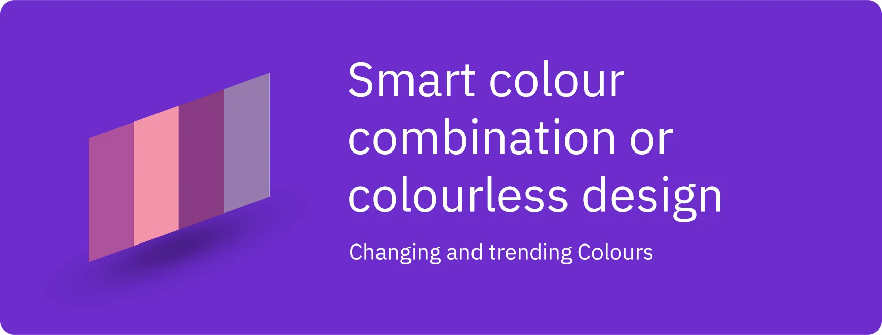
There are 2 types of visual aesthetics that are changing and trending in the game recently. Either you choose a smart colour gamut or colourless design to give a traditional vintage appeal. Sometimes you can also try visual elements with retro, sepia and cinema-grade to fit the properties of what you are looking for. But the real trendsetters recently has been the dark mode trend, which has received an overwhelming response from users across the globe. As they are saying, Black is the New White!
Also to suit the mood boards for brands and their wide range of products and services, web designers are finding middle ground in soft colour palettes, like wholesome greens, pastel blues, warm browns or light pinks. These not only make the website colours less jarring than pure black or pure white, but they also induce calm and visual relaxation.
Colour schemes in web design have been trending towards gradients as well for a while now, with three-dimensional colour transitions becoming more lifelike than ever. Taking their cue from Apple’s Big Sur OS, it is expected that colours that need to be used are saturated and three-dimensional, almost like extracting right out of the screen
Using colour mindfully to evoke certain moods will be significant in 2021. Colour psychology, the study of colour’s impact on human behaviour, has been around for designers to interpret some general feelings associated with colours. While green typically denotes nature and organic products, red symbolizes passion and energy. In 2021, web designers will focus on implementing colour mindfully to evoke the mood a site is meant to represent.
There are a smart combination of colour aesthetics to try this year
- Soft colour tones to be tried for fashion & luxury brands for a classy, timeless look
- Blue and green gradients with white text can be tried for product-based pages
- Try retro coloured tones with throwback orange and red tones.
- A very little touch of earth tones with olive green on the front can be tried for organic appeal
- A lot of trending websites have managed to combine red that is balanced with muted tones.
08 - Evolution of Typography
We are experiencing a long-range of explosions in typography which was virtually impossible a few years back. In recent years brands have been strategizing more about typography, styles, colours, decoration, hover effect, icons and emojis to express through text and increase brand engagement.
Here are some suggestions to try out which may gain momentum in 2021:
- Fonts and typefaces are also increasing design aesthetics. The use of bold typefaces is a trend that gives personality to texts and is overtaking images as the main design element.
- Within the creative use of typography, there is a standard decrease in brush lettering and an increase in 3D illustrated types of animated text. You can try a composite editorial design instead of a classical one.
- Try hero fonts and larger text sizes associated with icons, while starting out with a paragraph
- Here is a CSS resource you can check for to use typography effectively.
09 - User Interactive Pages
Nowadays, rising numbers of UX/UI designers add interactive or animated elements, like audio or video media, scrolling interactions and more to websites to design interactive websites that can attract and encourage more site visitors to read and engage with the site contents. That is also why user-interactive page design has become an overwhelming trend in website design.
Here is how content affects user-interactive pages, a research study by demand metric suggests lead conversion increases up to 70% in user-interactive pages rather than a passive page altogether.
Here a question that may arise about how user-interactive pages are going to enhance conversion.
- As we focus on the buyer persona, these types of pages are helping in solving buyer problems in real-time with genuine content effectively.
- At some point in time, you may choose customer testimonials or product/service reviews if you are an e-commerce product based landing page, which might impact creating trust with customers.
- If you are implementing chatbots you might need to show some suggestions which users might be looking for on that specific page.
- Funnels must be created to keep user intent in mind to increase the conversion rate.
10 - Augmented reality and Smart Parallax
The immersive experience is different from the multimedia experience. Augmented reality is the new category brands are exploring nowadays and it's going to be hot in 2021. Mainly during the pandemic time, it grossed momentum as mobile brands and car brands launched several products at that time.
Augmented reality and smart parallax are related somehow to visualising a brand, product or service in a unique way. Technology is quite new and brands are adopting it faster.
Why it’s Hot
- As technology is new, user attention should be high
- Product launch can be done virtually
- Interaction levels are high with more users spending significant time online
How to implement
- Here is the resource by google to implement VR through webpages.
- For parallax, you can integrate layers, graphics and colours to have a smooth intriguing 3D effect.
- You can create a parallax effect while scrolling through a complete webpage by moving each element at a different speed.
- Here is a resource to check for to create a parallax effect due to the movement of the mouse pointer.
Conclusion
Websites are again increasingly making a paradigm shift since 2020. Previously it was just ok to have a web presence for your business, but post-2020 it has not only become a mandate for all businesses and brands globally to have their own web presence, but everyone is focussing on getting the best in terms of their web presence to adopt and attract users/customers. It is already a race for businesses to provide a unique user experience across their websites.
As we move through 2021, there are a few trends that are here to rule– quick website loading time, simple and clean look and feel, limited and effective content strategy and mobile-first strategy. Mobile commerce will also become even more important for selling to retail and boutique brands. As people are now spending significant time online browsing through sites and applications, there’s a growing need for a website that is fresh, engaging web designs to draw visitors to your pages.
Email us or Talk to us at +91-98367-81929 or Simply Contact Us through the website.
Let's Connect


