Data Storage Decoded: Data Warehouse vs Data Lake Explained
Glass Morphism and liquid design for next-generation UI
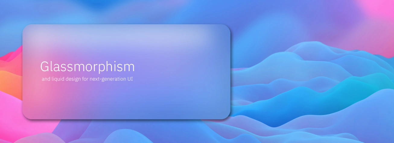
Glassmorphism for next-generation UI
If you take a footstep into the world of the latest web design trends, you may already have heard of Glass Morphism. Eye-catching and colourful, this aligned term trend evokes transparency and a multi-layered approach. With its resemblance to the milky glass surfaces, it has drawn a lot of attention.
Hello Glass Morphism!
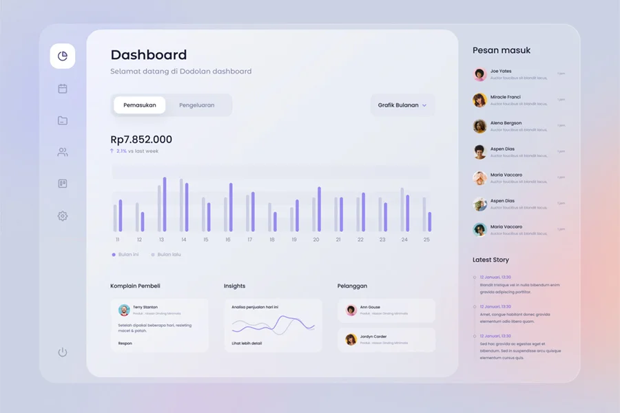
There is a new design trend on the block that is gaining popularity rapidly. Vividly coloured backgrounds, seemingly translucent objects, frosted-glass effects, floating-in-space features are the ones that have driven the term ‘Glass Morphism’ which pushes the boundaries of next-generation UI.
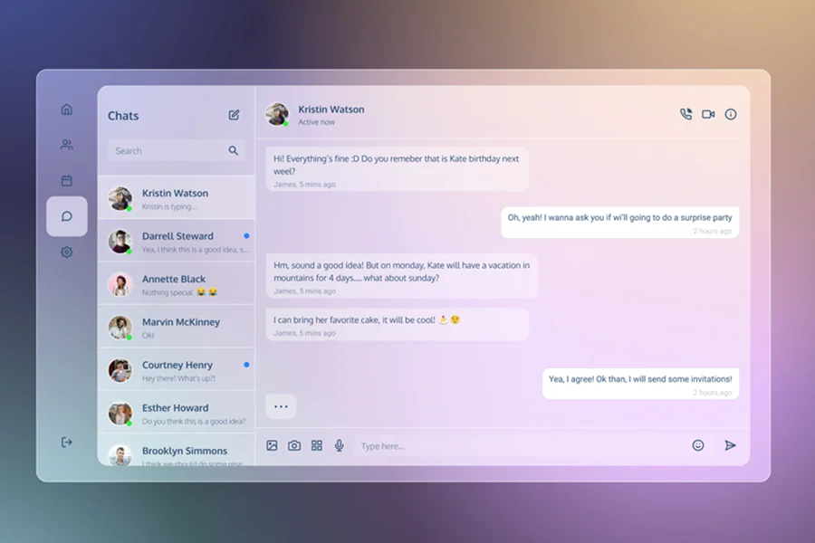
Glass Morphism is a term used to describe UI design that emphasizes dark or light objects, placed on the top of colourful backgrounds. A background blur is placed on the objects that allow the background to shine through the frosted glass.
Elements and Characteristics of Glass Morphism Aesthetics
“A Classy design that looks Glassy”- The design represents the picturesque layout of a “series of glass panels floating in the vertical space”. The name absolutely fits the looks and the effect, which is created based on an amalgamation that is made of transparency, vivid background colours, layers, and shadows.
Transparency
Transparency is achieved through the frosted-glass effect by making the background blur. This needs to be done to add depth to the design and to establish verticality. The designers also blur the objects to give the layout a sense of perspective as if it appears like they were floating in 3D space.
Multi-layered approach
With objects floating in space, the multi-layered interface projects a clean look that is also eye-soothing. This style works best with one or more transparent layers on a colourful and bright background
Vivid and Colorful background
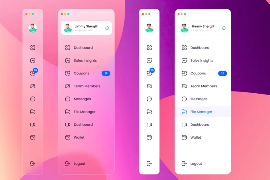
The background colour plays an important role in highlighting the blurred transparency, which always focuses on being both colourful and subtle. Dull, low-contrast backgrounds would simply fade away under objects and the effect would be lost. It is also noteworthy that subtle, semi-transparent white borders are used as light borders on translucent objects to simulate the glass edge and to make objects stand out from the subtle background.
Why has Glass Morphism become the talk of the design agencies?
Glass Morphism is a modern UI design trend that’s steadily been gaining popularity in recent years. It is utilized in web and app design and is quickly becoming mainstream. But it isn’t a brand new idea as the style is strongly influenced by similar concepts that have been first introduced by Apple in 2013 with iOS 7. The trend re-emerged in November 2020 when Apple brought back the design effect with the latest update, MAC OS Big Sur.
It has since been used by Microsoft and Windows Vista as part of their Fluent design system. If you remember the switch to iOS 7 and Windows Vista, you will recall how refreshing it was to view notifications popping up with blurred items against the background. This effect is known as “The Acrylic” and uses it on app surfaces to add depth and establish a visual hierarchy.
The style has developed over the years. It has reinvented itself with modern fonts, shapes, and colours to keep things fresh. Let’s catch a quick glimpse of some of these examples to see why this trend is so popular.
How to implement Glass Morphism in Web Design in Easy Steps?
Picking the right layers
While applying this latest trend, designers first need to go through the app mock-up or the website and select the ideal vantage point to reflect the head-turning glassy looks prominently. It is recommended not to overuse it. It looks eye-soothing over light and colourful backgrounds. The Icons over it must be designed tactfully and can be accessed from anywhere without any glitch. Whilst they are becoming more common, we recommend using the layers with great consideration.
Implementing Glass-a-like looks
Glass Morphism aims to create the illusion of a glass-like panel floating over a background. Setting the right grade for transparency is relatively easy with common design tools such as Figma. Instead of the entire shape, it is only the fill that is made transparent.
If this jargon term makes you worried about the technical inefficiency of the designers, then you must not tear your hair thinking that non-technical designers can also comfortably bring on this effect by tweaking your HTML/CSS.
To implement a glass morphism effect for your website or application, here is a CSS resource to check for and to Implement it directly. You can try multiple effects and how it is suiting as per the requirements.
Adding dimensions to bring on realism in design
Add a fine border to your object and lower its transparency to make it look glass-like to give your design some dimension. A shadow underneath will give you a sense of depth and these are slightly more technical changes that need to be tweaked in your code. If coding isn’t really your forte, you’d like to incorporate this trend into your own web design
Colour pallets to choose from for a Glass Morphic effect
Mainly pale colours are used for surfaces. Colours that are close to white and grey with low chroma key. Choosing a soft colour is key to minimalist design in Glass Morphism. Here you can choose a vivid colour with different colour gradients for an anomalous effect. Here are the colour pallets to choose directly from for the background in glass morphism design.
What is Liquid Design?
The term "liquid" implies the smooth flow of the website into the space it occupies. If you are using a high-resolution monitor, this may mean that you need to resize your browser. If you have a low-resolution monitor, you will still see the information compactly.
If you do Liquid Design right, you should be able to make your pages display on almost anything and still make sense to the user. But it’s not just about making a page with the browser window. The Principles of Liquid Design align with the principles of accessibility when you build your site using relative font units and percentage-based widths for common elements. This will make the user interface a lot easier for a portion of your visitors.
Website design trends have solved the problem of multiple screen sizes in a few ways. One solution is fluid design and it is becoming more and more popular. Instead of fixed columns and widths, a fluid website is built on relative widths, grids, and percentages. This allows the website to scale up and down fluidly.
Liquid Design concept is about making 'Web' a Better Place’
The first thing you’ll need to do is to change the way you think about the Web.
- Throw away the idea of having your pages look exactly the same on every device
- Start thinking about accessibility issues as you design
- Hold your head high as you are on the way to make the net a better place!
The liquid design concept is about creating customer-focused communication that’s simple, clear & engaging. This design concept strategically positions the brand to make it stand out from the crowd and gifts it a brand new personality that resonates well with its audience. It delivers a delightful experience to make the customer come over and over again.
What's the Difference Between Fluid and Responsive Website Design?
You may have heard the term "responsive design" and now you're wondering how it makes a difference when comparing with fluid or liquid design.
Responsive sites use media queries to control the design as it scales up or down on the device. They also have breakpoints and set containers, so you have different "breakpoints" for different screen sizes; extra small for mobile and large size for desktop.
"A fluid site is responsive, but not all responsive sites are fluid."
- Sam McKinney
So, now to be a little more technical with explaining. Many of these websites have very minimal navigation, moving elements on the homepage, and all use the entire width of the page. Seeing is believing! Words do these websites no justice. You have to see them in action to understand the difference and why fluid design is special.
Any designer who seeks 100% compatibility should take the time to set up a fluid layout. The main challenge isn’t the excessive white space in large screen resolutions, but rather the small percentage of users with a small screen resolution. For websites with large audiences, it should have a neat and user-friendly design anyway, which can be done effectively with a liquid design layout.
Email us or Talk to us at +91-98367-81929 or Simply Contact Us through the website.
Let's Connect


